
Posted October 29, 2013 at 02:01 pm
Sometimes, I get to draw cool things.
A while back, Adam Warrock (Euge) contacted me about designing a shirt for his upcoming tour which kicks off in December.
Chibi and fucked up? I'm the artist for the job!
I let the idea mull around in my brain meats for a little bit before I put pen to paper. Then I did a few quick thumbnails to play around with composition. In general, clients like to have a few ideas to choose from, but if you give them too many options, nine times out of ten they'll pick something you don't like. Best to whittle the choices down to your strongest ideas so that no matter what the client chooses, you'll enjoy working on the piece.
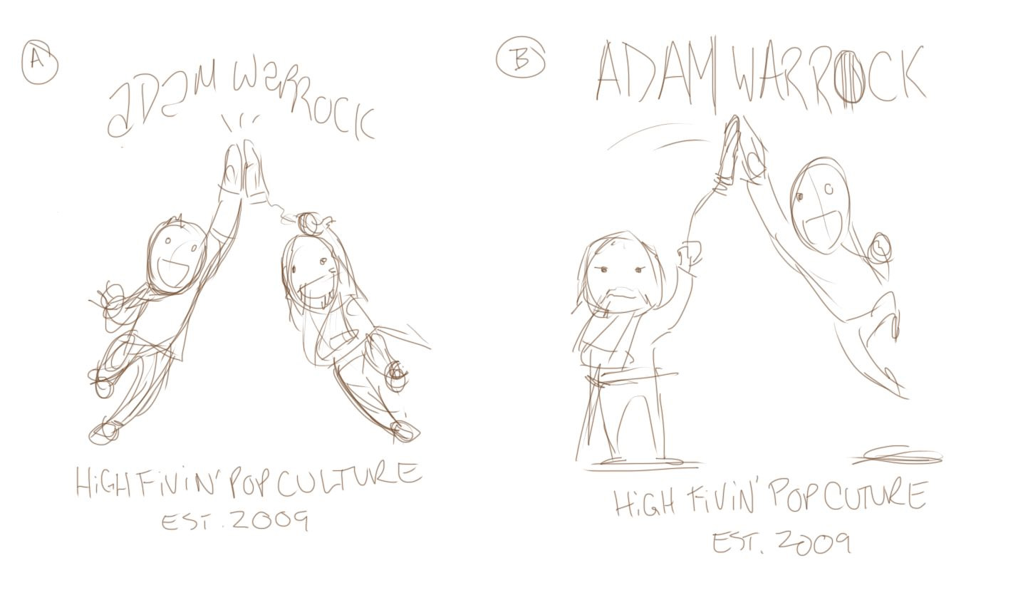
I ended up sending Euge two sketches that I whipped up in Sketchbook Pro.
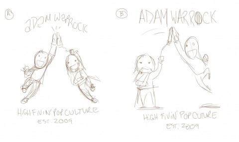
Though design A responded exactly to what Euge requested, design B captures the absurdity of the situation. And it makes me laugh. Thankfully, Euge agreed and we went with B.
Next step is to put pencil to paper. I prefer to draw on paper. I find that I hesitate less when the undo option is unavailable to me. I also work a lot looser on paper than I do digitally and I felt the figures needed that sense of motion.
Laying in the basic forms, I try not to do too much more rendering than this. I know I'll be inking the piece so drawing a thing twice over takes more time. But sometimes, I just feel the need to work in more details at the penciling stage. I didn't do too much more with the faces, but I did work in the fingers and clothing details.
When I first started doing Yellow Peril, I only inked with a sable brush. Now I use pretty much anything that's on my desk that's loaded with water proof ink. I generally start with the faces first and hop around as I go.
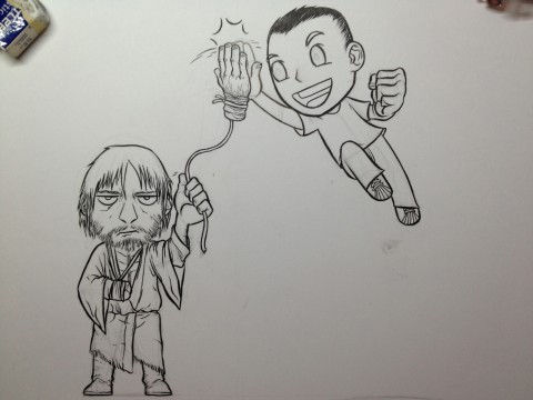
For things like hair, stubble, and clothing folds, I'll usually use a brush of one sort or another. Everything else is sort of up for grabs. I used a micron for Euge's shell toes. I do all my corrections in Photoshop so I don't freak out too much about smudges or tangents. And I've got to scan this thing into a computer anyway for color separations.
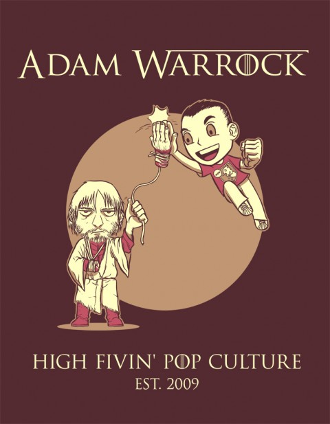
I scan at 600dpi because I want to retain as much lineart detail as possible. Then it's a matter of figuring out which bits to color what. Euge was aiming for a three color shirt.
And bam!
Since the design was going on a dark shirt color, I used that for the lineart which meant I had three colors to play with for shades and tones. If it was a light color shirt, one of the colors would have been used for lineart. This gave me a lot more flexibility so I was able to do some cell shading to add depth to the piece. Some font play, some layer separation, some Pantone swatches, and we're ready to print!
I can't wait to see this thing on tour on a shirt on bodies. I had a lot of fun with it and I'm so glad Euge gave me the call.
And that's how a shirt is made! Well, one way.
A while back, Adam Warrock (Euge) contacted me about designing a shirt for his upcoming tour which kicks off in December.
My idea is this:
Like sorta chibi versions of me and Jaime Lannister in like a cloak and a beard and all shitty, and he's missing his one hand (like when he's with Brienne). And we're jumping up and high fiving each other and he's swinging his hand on a string to high five me?
Top text says: ADAM WARROCK
Under text says: HIGH FIVIN' POP CULTURE EST. 2009
Chibi and fucked up? I'm the artist for the job!
I let the idea mull around in my brain meats for a little bit before I put pen to paper. Then I did a few quick thumbnails to play around with composition. In general, clients like to have a few ideas to choose from, but if you give them too many options, nine times out of ten they'll pick something you don't like. Best to whittle the choices down to your strongest ideas so that no matter what the client chooses, you'll enjoy working on the piece.
I ended up sending Euge two sketches that I whipped up in Sketchbook Pro.
Though design A responded exactly to what Euge requested, design B captures the absurdity of the situation. And it makes me laugh. Thankfully, Euge agreed and we went with B.
Next step is to put pencil to paper. I prefer to draw on paper. I find that I hesitate less when the undo option is unavailable to me. I also work a lot looser on paper than I do digitally and I felt the figures needed that sense of motion.
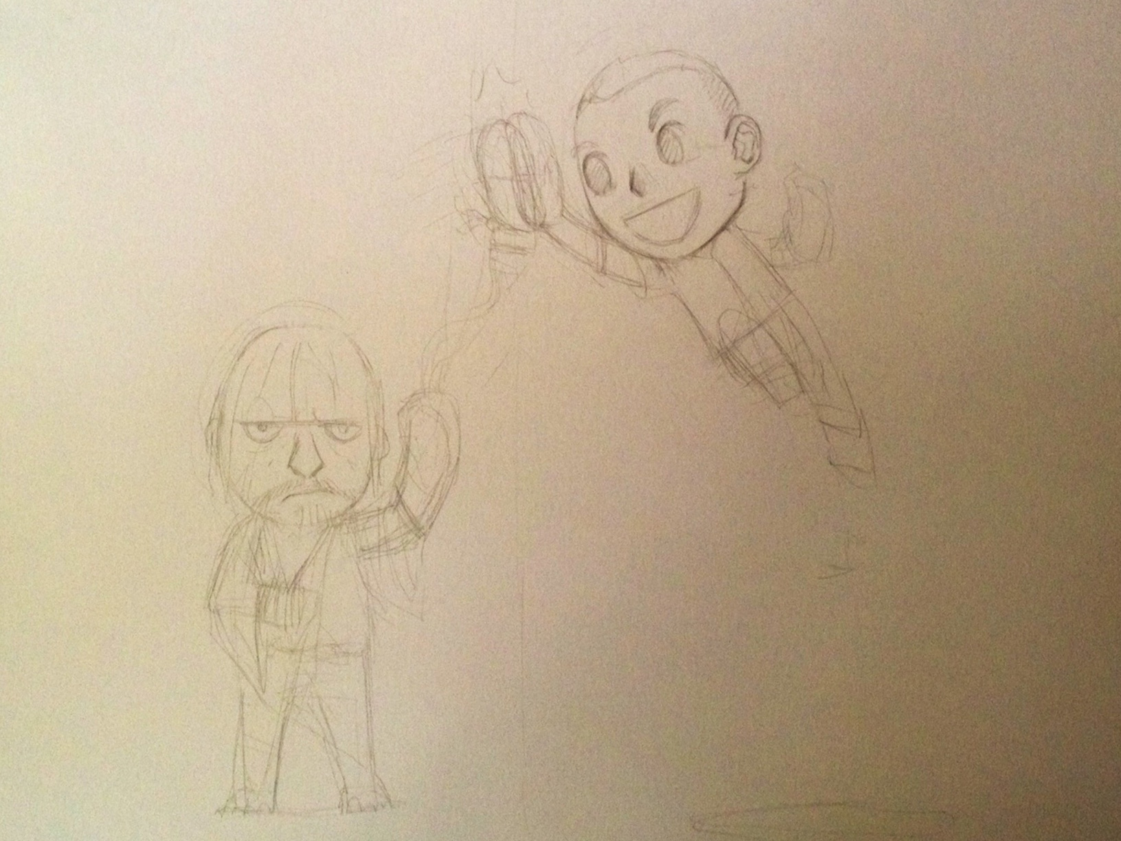
Laying in the basic forms, I try not to do too much more rendering than this. I know I'll be inking the piece so drawing a thing twice over takes more time. But sometimes, I just feel the need to work in more details at the penciling stage. I didn't do too much more with the faces, but I did work in the fingers and clothing details.
When I first started doing Yellow Peril, I only inked with a sable brush. Now I use pretty much anything that's on my desk that's loaded with water proof ink. I generally start with the faces first and hop around as I go.
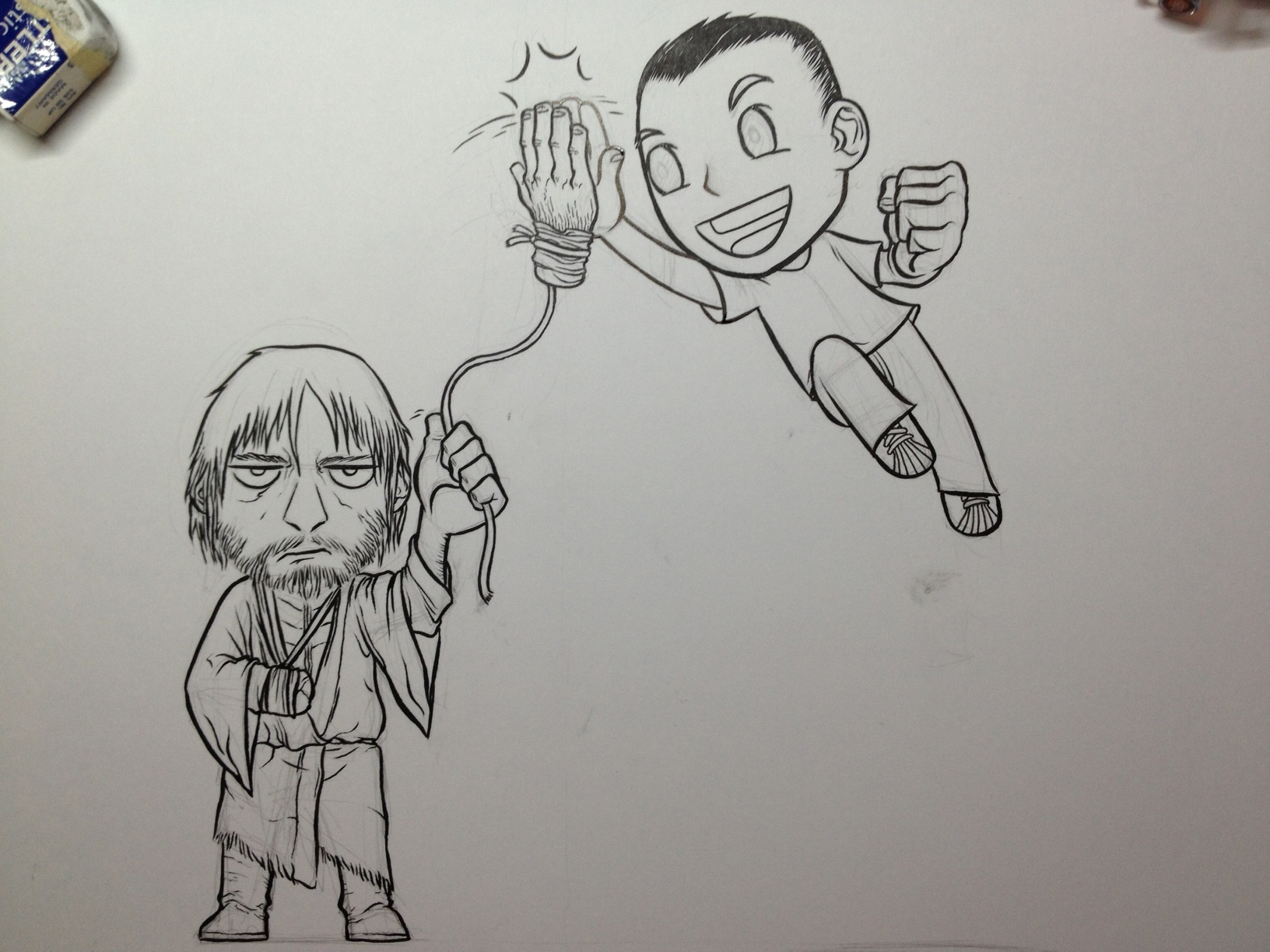
For things like hair, stubble, and clothing folds, I'll usually use a brush of one sort or another. Everything else is sort of up for grabs. I used a micron for Euge's shell toes. I do all my corrections in Photoshop so I don't freak out too much about smudges or tangents. And I've got to scan this thing into a computer anyway for color separations.
I scan at 600dpi because I want to retain as much lineart detail as possible. Then it's a matter of figuring out which bits to color what. Euge was aiming for a three color shirt.

And bam!
Since the design was going on a dark shirt color, I used that for the lineart which meant I had three colors to play with for shades and tones. If it was a light color shirt, one of the colors would have been used for lineart. This gave me a lot more flexibility so I was able to do some cell shading to add depth to the piece. Some font play, some layer separation, some Pantone swatches, and we're ready to print!
I can't wait to see this thing on tour on a shirt on bodies. I had a lot of fun with it and I'm so glad Euge gave me the call.
And that's how a shirt is made! Well, one way.
Comments
